How to Create a Web3 Connect Wallet Button in React
In this guide, learn how to create your own custom Connect Wallet button easily.

⚠️ Warning: This guide currently uses v4 of the Connect SDK. For v5 (latest) code snippets, please check out our documentation while this guide is being updated. ⚠️
In this guide, learn how to create your own custom Connect Wallet button — using our UI component builder to customize it and drag-&-drop it into your React app or website — or our Wallet SDK to build a custom flow from scratch
Let's get started!
Connect Wallet Builder
In this section, we will see how to use the Connect builder on the thirdweb dashboard to build a custom Connect wallet button!
Head over to the Connect Wallet page on the thirdweb dashboard. You'll get a page with many customization options for your Connect Wallet button:
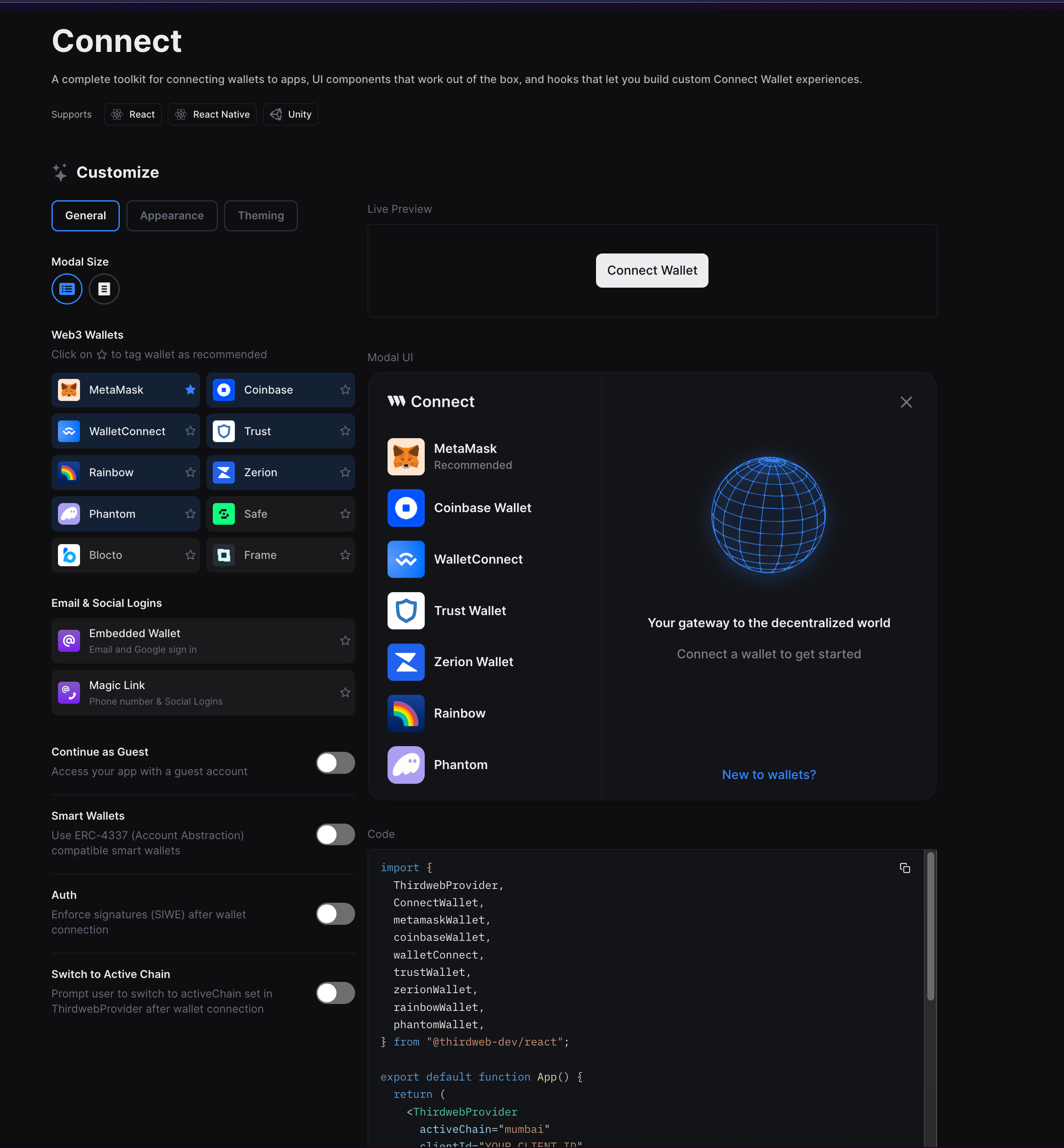
General
In the general tab, you can select the wallets and methods that you want your users to connect to your site. You can also toggle auth and switch to active chain here.
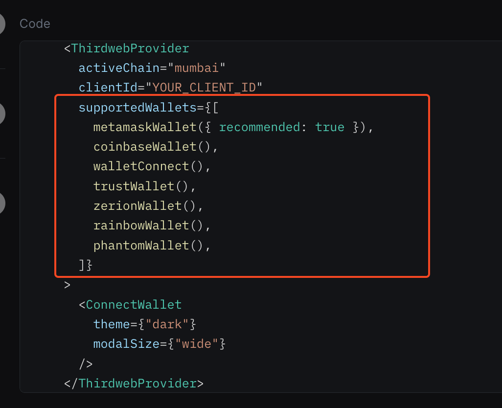
In the ThirdwebProvider there is a prop called supportedWallets which takes in an array as the argument. You can pass in all the wallets here. If you take a look at the code section, you'll be able to see it:
Setting up Smart Wallet and Auth requires a little more setup. You can take a look at their respective guides to know more about them if you want to add them to your app:
Appearance
The appearance tab mainly focuses on branding your connect wallet button and modal. You can change the texts, icons, splash images, etc. You can also add a link to your privacy policy or TOC if you like! You can change the values here as you wish. Once you are done, you can play around with the live preview to finalise everything.
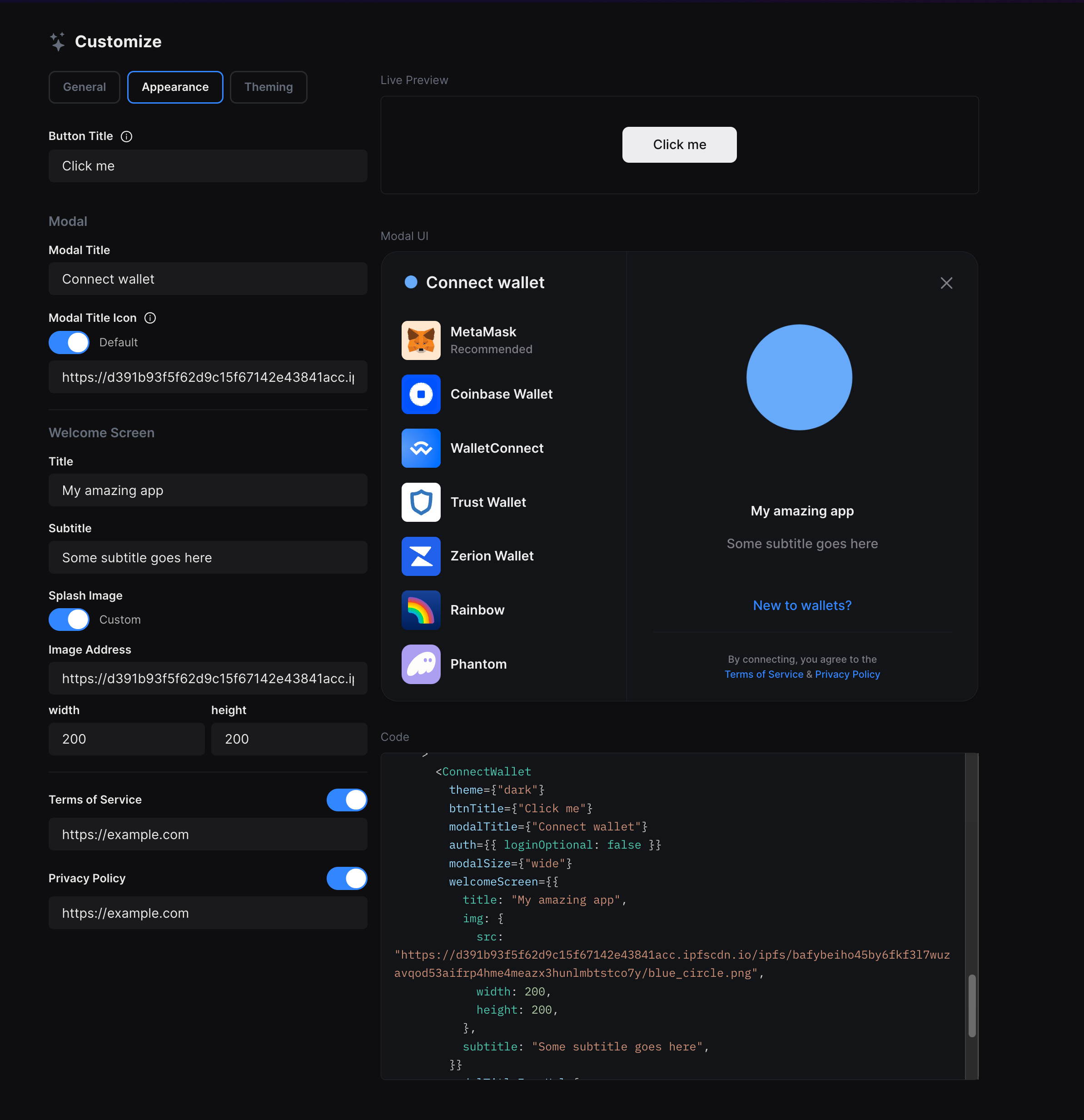
If everything looks good, copy the props from the code section and paste them into your React app to replicate the button.
Theming
You can change the colour of pretty much everything that you see here!
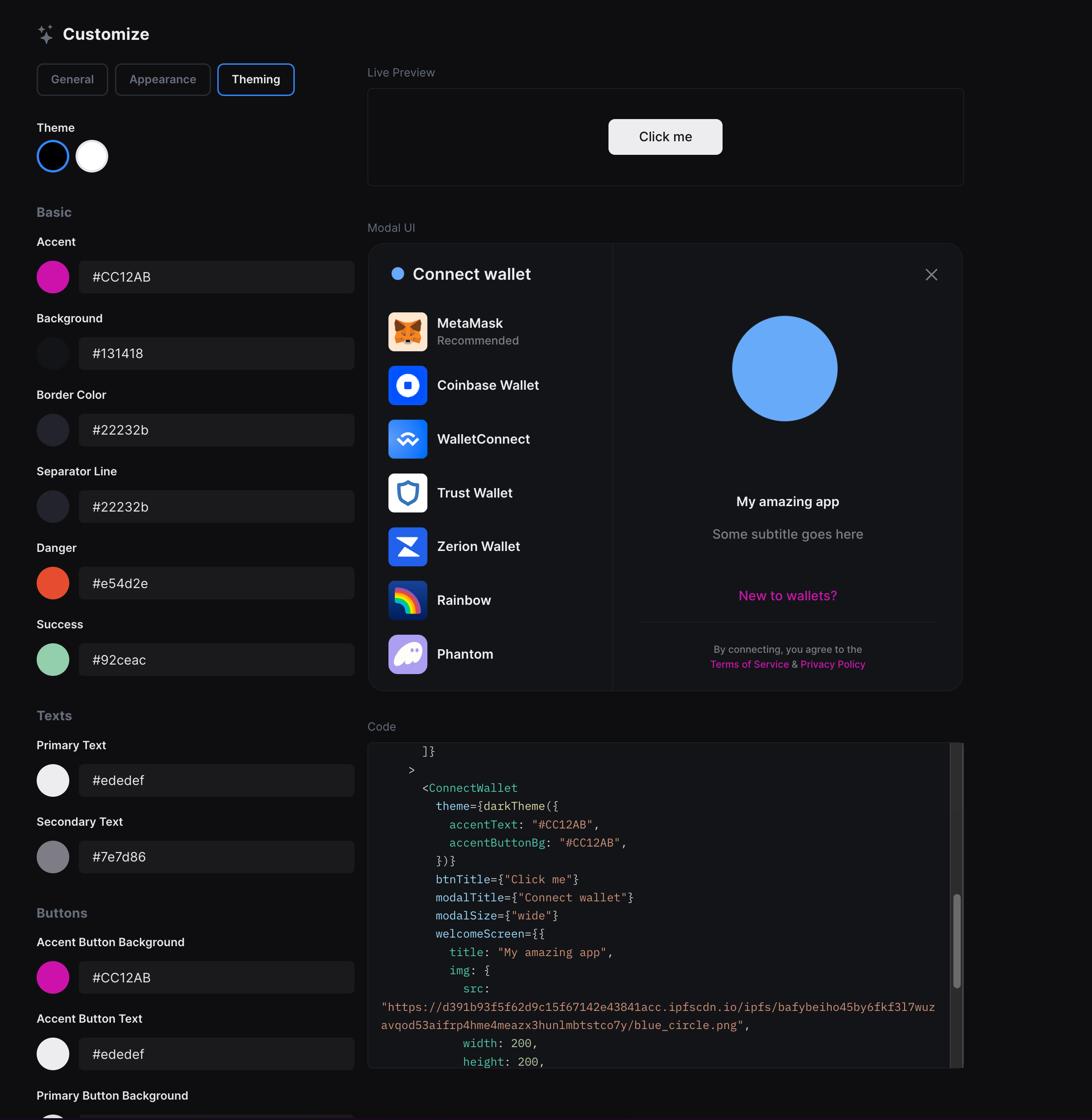
This adds the theme prop to the ConnectWallet button where you can change the colours of all the options available.
Building a connect wallet button from scratch
We will now build a connect wallet button in a react app from scratch. Hope you already have a react app setup with thirdweb, but if not, you can use thirdweb create to spin up a new app:
npx thirdweb createChanging the button styles
We will add a className to the button to change the styles of the button. If you are using our Next.js starter you can add the class using CSS modules like this:
<ConnectWallet className={buttonStyles.connectButton} />
Now, you can head to the CSS file and add your styles. I am going to add these styles for now:
.connectButton {
  background-color: #405cf5 !important;
  border-radius: 2px !important;
  -webkit-box-shadow: 10px 10px 20px -6px rgba(100, 230, 250, 0.7) !important;
  -moz-box-shadow: 10px 10px 20px -6px rgba(100, 230, 250, 0.7) !important;
  box-shadow: 0px 0px 20px 2px rgba(100, 230, 250, 0.7) !important;
  color: #fff !important;
  cursor: pointer !important;
  font-size: 100% !important;
  height: 44px !important;
  padding: 0 25px !important;
  position: relative !important;
  text-align: center !important;
  transition: all 0.15s ease-in-out !important;
}

.connectButton:hover {
  box-shadow: 0px 0px 40px 5px rgba(100, 230, 250, 0.7) !important;
  transform: translateY(-2px) !important;
}
This will give you a button like this:
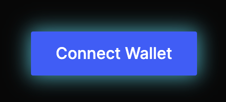
Feel free to change the styles to customise the button to your liking, but make sure to add the !important property to override the default styles.
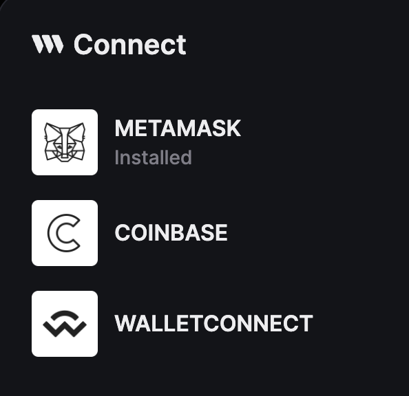
Changing wallet icons
If you don't want to use the boring default icons, you can also use custom icons! Head over to where you have initialised your ThirdwebProvider (_app.tsx in the case of Next.js) and add the following:
  const customMetamaskWallet = metamaskWallet();
  const customCoinbaseWallet = coinbaseWallet();
  const customWalletConnectWallet = walletConnect();

  customMetamaskWallet.meta.name = "METAMASK";
  customMetamaskWallet.meta.iconURL = "/metamaskIcon.png";

  customCoinbaseWallet.meta.name = "COINBASE";
  customCoinbaseWallet.meta.iconURL = "/coinbaseIcon.png";

  customWalletConnectWallet.meta.name = "WALLETCONNECT";
  customWalletConnectWallet.meta.iconURL = "/walletConnectIcon.png";
Just add the images to your public folder, and make sure to update the icon URL path to the path of your icons.
You can import these hooks from the @thirdweb-dev/react package like this:
import {
  ThirdwebProvider,
  coinbaseWallet,
  metamaskWallet,
  walletConnect,
} from "@thirdweb-dev/react";
Finally, pass these in an array in supportedWallets in the ThirdwebProvider:
<ThirdwebProvider
  clientId={process.env.NEXT_PUBLIC_TEMPLATE_CLIENT_ID}
  activeChain={activeChain}
  supportedWallets={[
    customMetamaskWallet,
    customCoinbaseWallet,
    customWalletConnectWallet,
  ]}
></ThirdwebProvider>
You can now see your much cooler icons by clicking the connect wallet button!
Custom theme
To change the theme of your connect wallet button and modal, you can pass a prop called customTheme with all the colors that you want to change:
 const customTheme = darkTheme({
    colors: {
      modalBg: "#FFFFFF",
      primaryText: "#FFF",
      walletSelectorButtonHoverBg: "#EEEEEE",
      separatorLine: "#FFFFFF",
      borderColor: "#EEEEEE",
      accentText: "#c0ffee",
    },
  });
<ConnectWallet className={buttonStyles.connectButton} theme={customTheme} />
This makes it look much better!
But the right-hand side seems too plain, so let's customise the welcome screen now.
Welcome Screen
You can pass another prop and write out your own JSX for the welcome screen:
<ConnectWallet
className={buttonStyles.connectButton}
theme={customTheme}
welcomeScreen={() => {
return (
<div
style={{
display: "flex",
flexDirection: "column",
alignItems: "center",
justifyContent: "center",
padding: 20,
}}
>
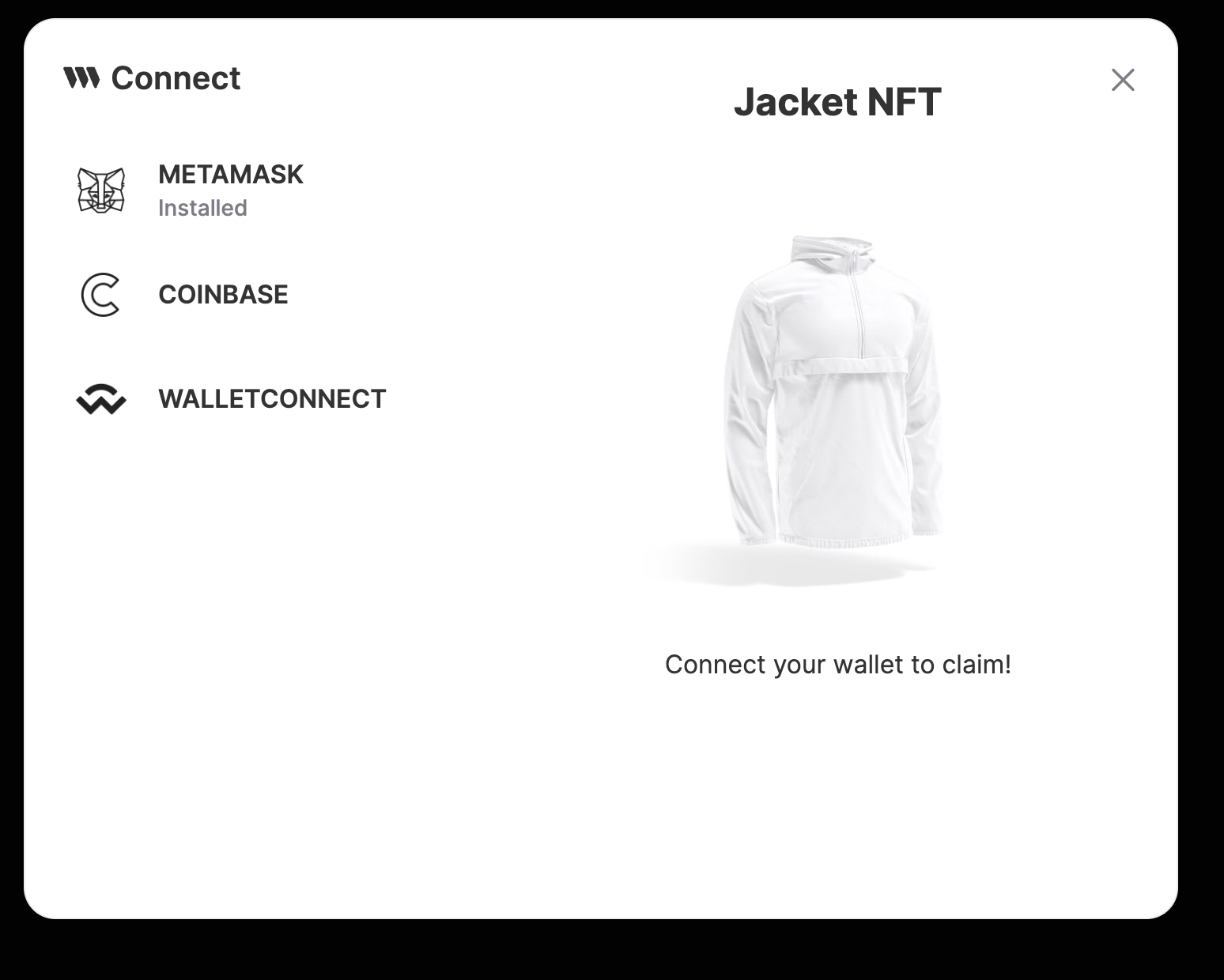
<h2>Jacket NFT</h2>
<MediaRenderer
src={
"https://3323f062efc9dd990230b2329a0dd753.ipfscdn.io/ipfs/bafybeicbhroiwbbclxncbbq3nfydge7l4qbwrcpiepwklj2zdgxgfho46u/AdobeStock_472097134.mp4"
}
width="175%"
/>
<p>Connect your wallet to claim!</p>
</div>
);
}}
/>This was a simple example with some text and an image, which gives a result like this:
But you can go crazy with your UI to add as many things as you wish!
Some other props
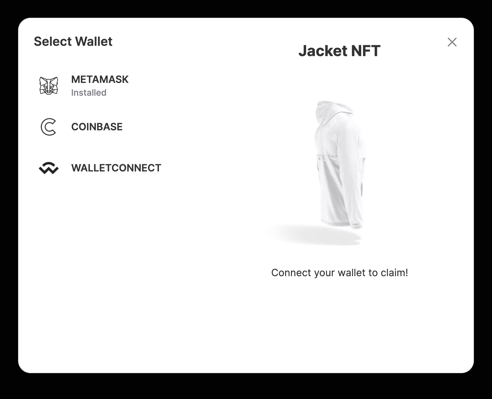
You can also change the button text, modal title, modal icon, and much more by just passing some props like this:
<ConnectWallet
  btnTitle="Connect"
  modalTitle="Select Wallet"
  modalTitleIconUrl=""
/>
You can see the full list of props here.
Combining all of these, we have an amazing connect wallet flow!
Wrapping up
This guide taught us how to create your own customized Connect Wallet button. You can now use it in your amazing apps!
Need help?
For support, join the official thirdweb Discord server or share your thoughts on our feedback board.