How to Fully Customize the ConnectWallet Button in the React Native SDK

⚠️ Warning: This guide currently uses v4 of the Connect SDK. For v5 (latest) code snippets, please check out our documentation while this guide is being updated. ⚠️
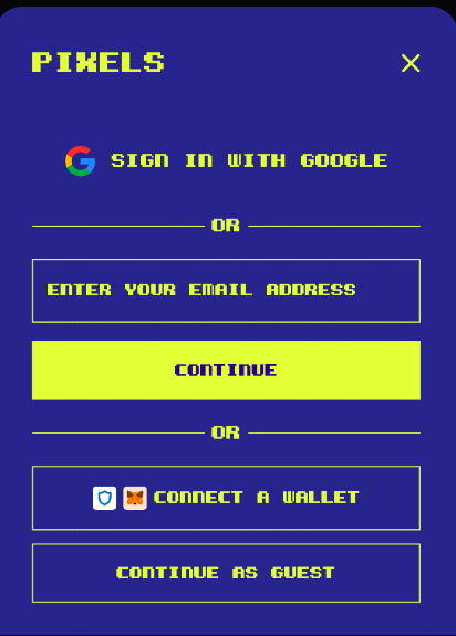
Here at thirdweb, we truly believe in giving full autonomy to developers on how to use our tools, and part of this effort is allowing full customization of our UI components. This blog post guides you through customizing the ConnectWallet button to match the Pixels game design as a use-case study.
Pre-requisites
- A React Native project up and running
@thirdweb-dev/react-nativeinstalled
Setup
Assuming you have a React Native project and the SDK installed:
Import the SDK's 'ConnectWallet' component.
import { ConnectWallet } from '@thirdweb-dev/react-native';
Customizing the Button title
Pass a custom title
<ConnectWallet buttonTitle="Link Your Wallet" />

Customizing the Modal title
Modify the modalTitleIconUrl and modalTitle props:
<ConnectWallet modalTitleIconUrl="" modalTitle="Pixels" />

Overriding Styles
The ConnectWallet takes a theme prop that controls most of the SDK UI component styles. You can pass your own custom object to change colours, background, borders and font.
To achieve this, you can override either the lightTheme or the darkTheme themes we provide or provide a completely new object. Below, we customize our darkTheme
import { ConnectWallet, darkTheme } from @thirdweb-dev/react-native;

const BACKGROUND_COLOR = '#272487';
const TEXT_COLOR = '#E8FE61';

<ConnectWallet theme={darkTheme({
  buttonBackgroundColor: BACKGROUND_COLOR,
  buttonTextColor: TEXT_COLOR,
  buttonBorderColor: TEXT_COLOR,
  borderRadii: {
    lg: 0,
    md: 0,
    sm: 0,
    xl: 0,
    xs: 0,
    xxl: 0,
  },
  colors: {
    background: BACKGROUND_COLOR,
    textPrimary: TEXT_COLOR,
    border: TEXT_COLOR,
    textSecondary: TEXT_COLOR,
    linkPrimary: TEXT_COLOR,
    backgroundHighlight: 'transparent',
    buttonBackgroundColor: TEXT_COLOR,
    accentButtonColor: TEXT_COLOR,
    accentButtonTextColor: '#230085',
    backgroundInverted: TEXT_COLOR,
    iconPrimary: TEXT_COLOR,
    iconSecondary: TEXT_COLOR,
    iconHighlight: TEXT_COLOR,
  },
})}


Setting a custom font
In React Native world, you need to add your custom font to your app before you can use it in a fontFamily prop. Let's walk through that process:
- Download your custom font and put it in the
assets/fontsfolder in your project's root folder. For our example, we downloaded theKemcoPixelBold.ttffont - Create a
react-native.config.jsfile in your project's root folder to tell React Native where your assets live:
module.exports = { assets: ['./assets/fonts']};react-native.config.js
- Use the
npx react-native-assetcommand to copy the assets to the native directories (ios/android)
Now you're ready to pass the font in your theme by modifying the textVariants prop. Note that we need to pass the fontFamily in all textVariants we want to change since we are using @shopify/restyle and there's a reported bug where defaults fonts are not correctly propagated on deeply nested components (see here and here)
<ConnectWallet
  buttonTitle="Link your wallet"
  modalTitleIconUrl=""
  modalTitle="Pixels"
  theme={darkTheme({
    textVariants: {
      defaults: {
        fontFamily: 'KemcoPixelBold',
      },
      bodySmallBold: {
        fontFamily: 'KemcoPixelBold',
        fontWeight: '600',
      },
      bodyLarge: {
        fontFamily: 'KemcoPixelBold',
        fontWeight: '600',
      },
      bodyLargeBold: {
        fontFamily: 'KemcoPixelBold',
        fontWeight: '600',
      },
      bodySmall: {
        fontFamily: 'KemcoPixelBold',
        fontWeight: '600',
      },
      bodySmallSecondary: {
        fontFamily: 'KemcoPixelBold',
        fontWeight: '600',
      },
      header: {
        fontFamily: 'KemcoPixelBold',
        fontWeight: '600',
      },
      subHeader: {
        fontFamily: 'KemcoPixelBold',
        fontWeight: '600',
      },
      headerBold: {
        fontFamily: 'KemcoPixelBold',
        fontWeight: '600',
      },
      link: {
        fontFamily: 'KemcoPixelBold',
        fontWeight: '600',
      },
    },
...
Now you must re-run your app to bundle the newly added font correctly, and voila!


Customizing the ConnectWallet button allows you to maintain brand consistency and improve user experience. Happy coding!
Need help?
For support, join the official thirdweb Discord server or share your thoughts on our feedback board.
